Showing posts with label Jodie Turini (4406). Show all posts
Showing posts with label Jodie Turini (4406). Show all posts
Wednesday, 3 February 2016
Evaluation Question 3 pt 1 - Jodie Turini
Rough Transcript:
We decided to pick a song by the ‘Jungle Doctors’ as we felt the
indie-rock genre is very popular at the moment and we could work well with
their song ‘Late.’ We began researching into their existing audience
demographic to get a better idea of who we would be appealing to.
We went onto their Facebook and Twitter pages to see the ages of the
people they had following them. From this, we decided our music video would focus
on a female target audience females around the age range of 15-24. We also
watched live performances of the band on YouTube to see what their crowds were
typically like. To further our research we explored more well-known indie-rock
bands to gain inspiration, these included; Arctic Monkeys, The Kooks and The Stroke.
We noticed a common trend in all their videos, the lack of a long narrative.
They tend to steer clear of a long narrative as they revolve their videos more
around them actually playing of the instruments. This is something we felt we
needed to incorporate into our music video.
Before we finalised any storyboards or ideas we went to our target
audience and asked their views on indie-rock and what they enjoyed listening
to. This allowed us to see if an indie-rock genre would appeal to our target
audience, from the research we found males were almost interested in
indie-rock, this extended our target audience further.
Once we had finished filming and began putting together a rough cut we
went back to our audience and asked for feedback. 90% of the feedback said that
they didn’t understand the link between the narrative and the band shots, the
band were not in the narrative and therefore it became confusing and disengaging.
Another comment said that the scenes shot in the park looked unprofessional and
rushed with no structure; overall the feedback was very negative. Unsure of
what to do we all sat in a group and spoke of our options, we understood what
the audience were saying and even agreed with them ourselves. We tried to stay
positive and came up with a whole new idea for a different song, but still by
the Jungle Doctors, already we were much more positive and felt it would work
well with our genre. Not wanting to make the same mistake again we asked
members of our audience before we began filming again what they thought of it,
all the feedback was much more positive.
Once we had finished filming the music video for the second time, and
had finished the postproduction stage, we presented the first draft of our
music video to a number of people within our target audience age group. We
asked people in groups of two so that others would be influenced in a big group
of people and produced unreliable data.
In relation to our print products, audience feedback was vital. We
produced a magazine advert and a digipack, however without constructive
criticism from our audience they wouldn’t look how they look today. For
example, the outside of our digipak was originally black and white, our
audience feedback came back and said that they felt it looked dull and not eye
catching enough, we changed it back to colour and found the feedback was very
positive. Also, some people said that they couldn’t see the synergistic link
between our magazine advert and digipak, we acted on this by editing both
images side by side with the same filters, so that they looked linked.
We presented our magazine advert draft to members of our target audience
and we attained a number of useful criticisms. For example, we were told our
texts were too varied in colours and we should stick to a theme of colours and
focus the attention on the picture and title instead. As a result of our
audience feedback, we were able to note down the elements our audience had told
us didn’t work, and what they felt would work better. We found that our draft
was a good base and from the feedback we were able to make a few changes and
move around the texts to create a more professional and eye catching advert.
Another example of where audience feedback has been essential is through
our digipak, including what image to use but also what font to use. In the same
way as the magazine we produced a digipak draft. After showing a group of
people, we were informed the font wasn’t easy to read and the red colouring
looked out of place. We took these criticisms and went away to plan a second
draft. We showed another group of people and they found it really looked like
an indie-rock digipak, the front cover was eye-catching and the angle of the
camera gave the picture an edgy. We were pleased with our audience feedback
upon our second attempt and overall liked how it looked.
In conclusion, initial research into our target audience age of the Jungle
Doctors band, and our audience feedback upon our video and print products
played a vital role in shaping our final work. As a group we were able to alter
our drafts, to create a final piece of sustainable work that our audience could
enjoy. This was important to us because our main aim of this project was to
present our audience with something they like. We took on board all our
negatives and positives as we valued the opinion of our audience.
Monday, 1 February 2016
Evaluation Question 2 - Jodie Turini
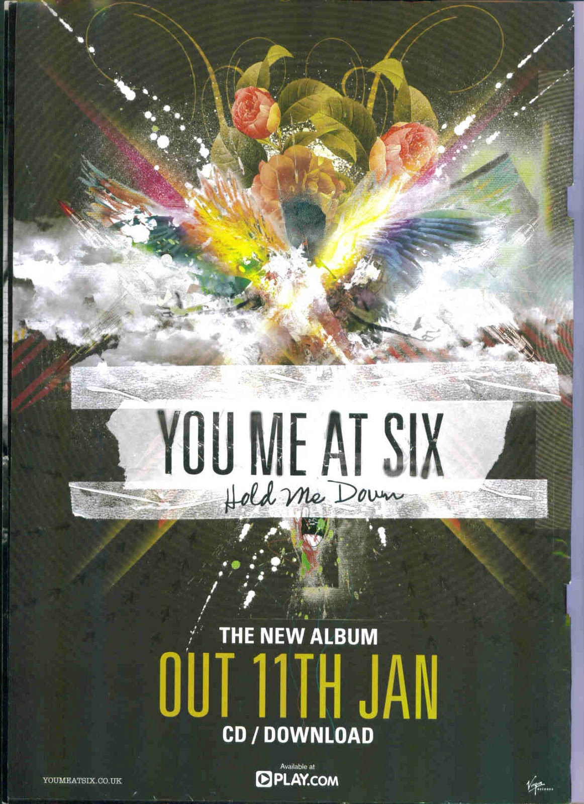
We created three products for the Jungle Doctors, this included a music video for their popular song “Late”, a complete digipak featuring two lyric booklets and finally a magazine advert to promote their album.
Throughout the development of the products I felt it was important to create a sense of 'synergy.' The
word synergy means: 'the interaction or cooperation of two or
more organisations, substances, or other agents to produce a combined
effect greater than the sum of their separate effects.' From researching
into synergy I noted that it was key we ensured that all our products
interlinked but also have a sense of individualism.
HOW ARE THE
MAIN AND ANCILLARY TEXTS CONNECTED?
Synergy between the
main and ancillary texts was produced through aligning all the products with
the indie-rock genre. A clear connection with all our products is the focus on
the band, using images of the band emphasised the indie-rock genre through
their fashion, facial expressions and youthful appearance. The focal point of the
main text (music video) is the band, from the performance shots, where they
showcase their raw talents and then in the narrative we wanted the audience to
get to know the bands individual personalities, which is evident when they are seen
messing around and being typical boys. As the main text is all about the band
we carried on this focus in our ancillary text by using visually stimulating
pictures for both the digipak and the magazine advert.
The kooks' album - 'Inside in / inside out'
Digipak:

Magazine
advert:

'The
Kooks' use a similar colour scheme, creating continuity and synergy with
their products. The colour scheme of black, white and red follow the genre
of indie-rock, simple, dark but effective; the indie-rock genre is more about the
music and talent than the design and exaggerate visuals. The image used by the
kooks is the same for the digipak and their magazine advert. These are perfect
examples of how synergy has been used to promote their products.
Creation of
the digipak
In order to make our
digipak & advert look convincing and professional we researched various
real digipaks from the indie-rock genre, we took inspiration from the
following:
When taking photos
for our digipak we soon realised we didn’t want a constructed
picture, we wanted to capture natural shots of the band. In order to do this
while filming we took stills in every location we film at, we positioned the
band in front of a nice backdrop and told them to wait there for several
minutes just talking. The effect of this was group shots of the band being
themselves, pulling natural facial expressions and creating an edgy indie
photograph.
Here is a selection
of pictures we took as potential digipak front cover shots:


The digipak cover
photo was taken on a bridge, overlooking The Serpentine in Hyde Park, an iconic
London landmark. As our band are part of the indie-rock genre we felt that
using a background of locations such as the London eye or Piccadilly circus may
give the impression of a pop genre culture, due to the bright vibrant lighting.
The still image used
was taken on set when filming part of the narration for the video. We felt Hyde
Park was recognisable but with editing could look edgy and ‘cool.’ By using
Hyde Park for our music video, digipak and magazine advert it adds to the
synergy of the products and their interrelation.

INSIDE DIGIPAK
The digipak follows a
theme of the outdoors and nature, as well as, pictures of the band. In order to
make our digipak unique we used the technique of lowing the contrast on the
images, resulting in a faded appearance.
For our band message
we choose a still taken from filming, the image was captured when the band were
in place for a time-lapse, so they were unaware we were taking pictures, we
felt that this added to our natural image. Also, in the background is Oxford Street,
showing busy London and the famous London buses, this adds to the
mise-en-scene, as well as, acting as synergy with our music video.

BAND MESSAGE
When choosing images
for our lyric booklet feature we felt that another image of the band may
distract from the focus on the song and the lyrics. Therefore, we used images
that were taken on locations we visited during filming, by using images of the
sunset and London road I feel it gives off an urban, indie vibe.

LYRIC BOOKS
Synergy between the
digipak and the video was formed through using imagery, we found that a large
majority of the digipaks we looked at different have pictures of the band on
every page. For this reason we chose to use pictures of the locations we shot at
for the digipak, therefore, we used a London street and a sunset, we felt this
set a unique and indie tone to the digipak, as well as, tying it into the music
video.


MEETING THE BRIEF
The task in hand was
to product a promotional package for the album and therefore it was vital to
create a synergistic element between the music video and our two ancillary
products. The idea of synergy within the marketing and promotion of the band is
key to a successful reception of the band’s music which is the main focus of
the promotional package. For example if people are visually stimulated by the
magazine advert then they are more likely to view this music video and then
proceed to buy the album/digipak because all three products feature synergistic
elements which created the initial interest. In conclusion, the use of synergy
between the products and there interrelationship will enable the successful
marketing and in turn sale of the album which is the main aim of the
promotional package.
Our media products:
OUR PRODUCTS OVERALL
Overall, as I look
back on our products as a whole I am very pleased with the outcome, I think our
group successfully worked together and were able to produce high quality,
professional products. I would argue that we created a strong synergistic
element between the products as they all intertwine with each other. I feel our
video is my favourite product, due to the effort, time and numerous re-filming
of scenes we went through until we finally felt it had reached the standard we
had set for ourselves.
During the product of our video we had several setbacks, including; a change of
song and new video idea after receiving audience feedback that our narrative
and song clashed greatly, we changed our idea. Keeping positive we came up with
a new idea and went to London and filmed until the late in the evening, going
all around central London in the freezing cold, with all our equipment. We then
spent several sessions after school trying to capture our band shots. After
more audience feedback and reviewing the footage ourselves we felt they band
shots didn’t look as professional as we hoped for, therefore, we arranged more
filming time and enlisted the help of another friend to play the drums, as well
as, changing the lead singer and location. Finally, we reached the final
moments of editing when we lost all our editing and footage; after no luck it
dawn on us that we may have to re-film and edit the entire video, which
slightly broke us as a group, all we could do was hope. Thankfully, we were
able to restore the editing and footage and the video was saved! When watching
back the video and seeing the journey that led us to the final product I feel a
great sense of achievement. As a group we continued to work together and
remained dedicated to making completely our product to the highest standard,
for that reason I feel out of all three products our music video is my
favourite product.
Our music video:
Sunday, 31 January 2016
Wednesday, 20 January 2016

Wednesday, 6 January 2016

Friday, 18 December 2015
Thursday, 17 December 2015
Tuesday, 15 December 2015

Monday, 14 December 2015
Magazine Rough Copy (Jodie)

Our magazine advert follows the theme of other indie boy band, focusing on a natural picture with a minimal background; including different font styles & sizes, with reviews and rating in small.
Groups from Jodie Turini
Research & Planning: Magazine Image Research (Jodie)
While filming the music video we took various stills of the band in all the locations we visited, this enabled us to have a great deal of choice when designing our digipak and magazine advert.

We attempted to use the same image from the digipak onto our magazine but due to it being a close up landscape shot, we could not crop it in order for it to be the standard image size of a magazine. As seen in the examples below, all of them are portrait in order to ensure they fit in the magazine; also, they have a small colour scheme and contain vibrant colours.
 |
| Following gold/black/white theme, strong bold colours on a black background. Includes reviews, praising the album. The focus is on Ellie's picture and face, drawing all attention to her. |
 |
| Focus is on the name of the band, selling their name in white strip, in contrast to the dark background colour. The cover follows a faded colour look, and it doesn't include a picture of the actual album. |
 |
| A simple, old fashion design, using the same text throughout the logo. Individual pictures of the band, making all the focus on them, their setting reflects their genre of indie rock. |
MAGAZINE CHOSEN IMAGE

Why we chose this image?
- Can be cropped to become portrait
- Sun is shining on their faces (natural spotlight)
- The band are pulling natural faces, it doesn't look staged
- The setting of outside reflects our music video
- Vibrant colours (background)
Thursday, 10 December 2015
Research & Planning: Fonts - Magazine (Jodie)


FONTS FOR 'Debut Album Out June 13th'


Tuesday, 8 December 2015
Monday, 7 December 2015
Subscribe to:
Posts (Atom)